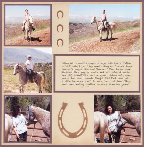
This page was a real revelation to me. I thought I had figured out exactly what I wanted, and had everything all laid out with brown edging, but something just wasn't right. I kept going away and coming back to look at it, but I just didn't like it. The lighting in the photos was kind of weird and it just didn't go with the brown, somehow (of course it may be a matter of the developer rather than the lighting). After trying a few different colors I finally settled on this purplish color (I think it's Bazzil burgundy). It fits the odd cast of color in the photos, and it even matches the shirt I was wearing. Amazing how that works.
I got the horseshoe from http://dgl.microsoft.com/ |

